AI infrastructure identity / Visual concept
A clear signal in a complex system.
The perspective / Neron
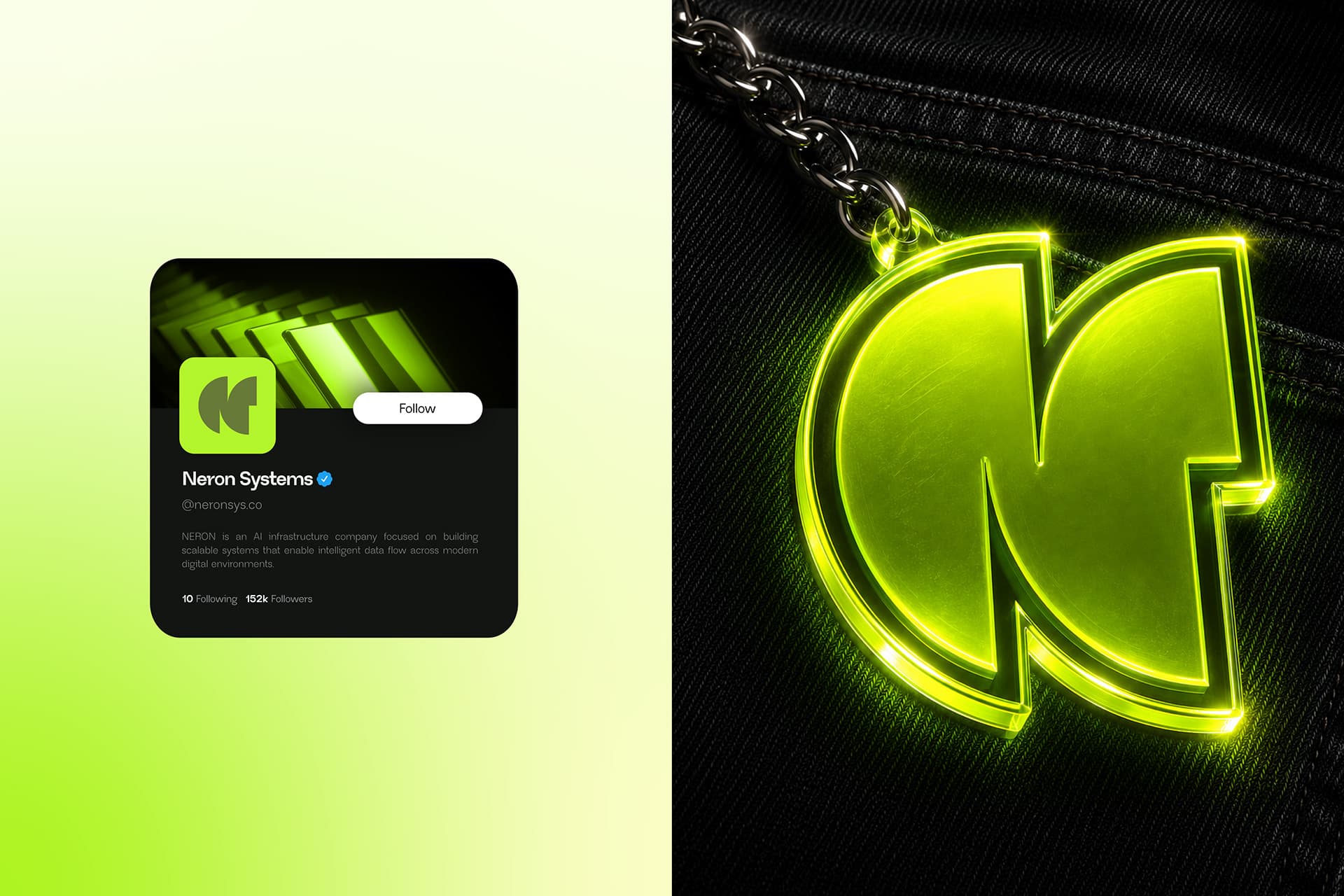
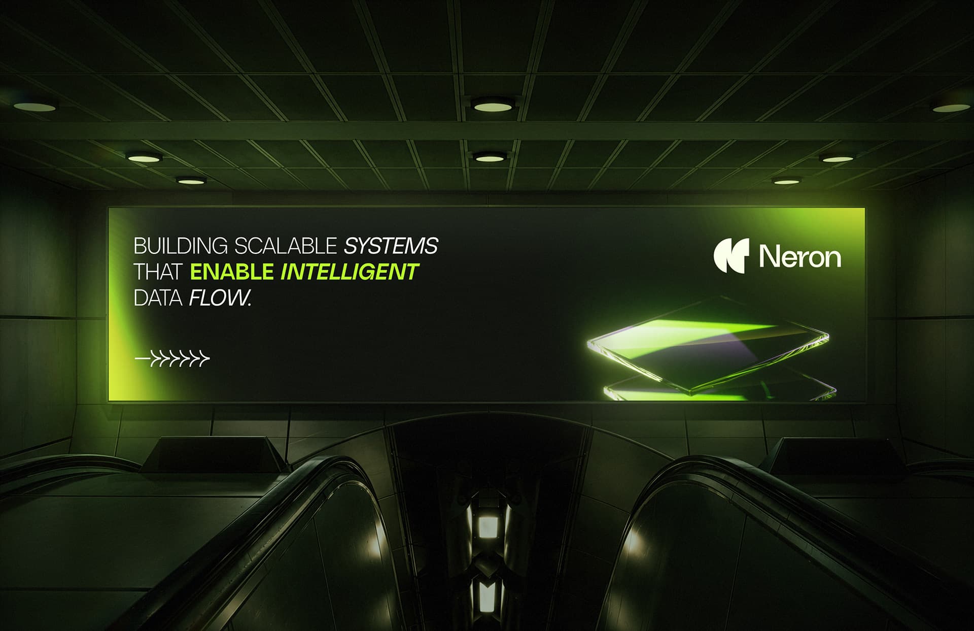
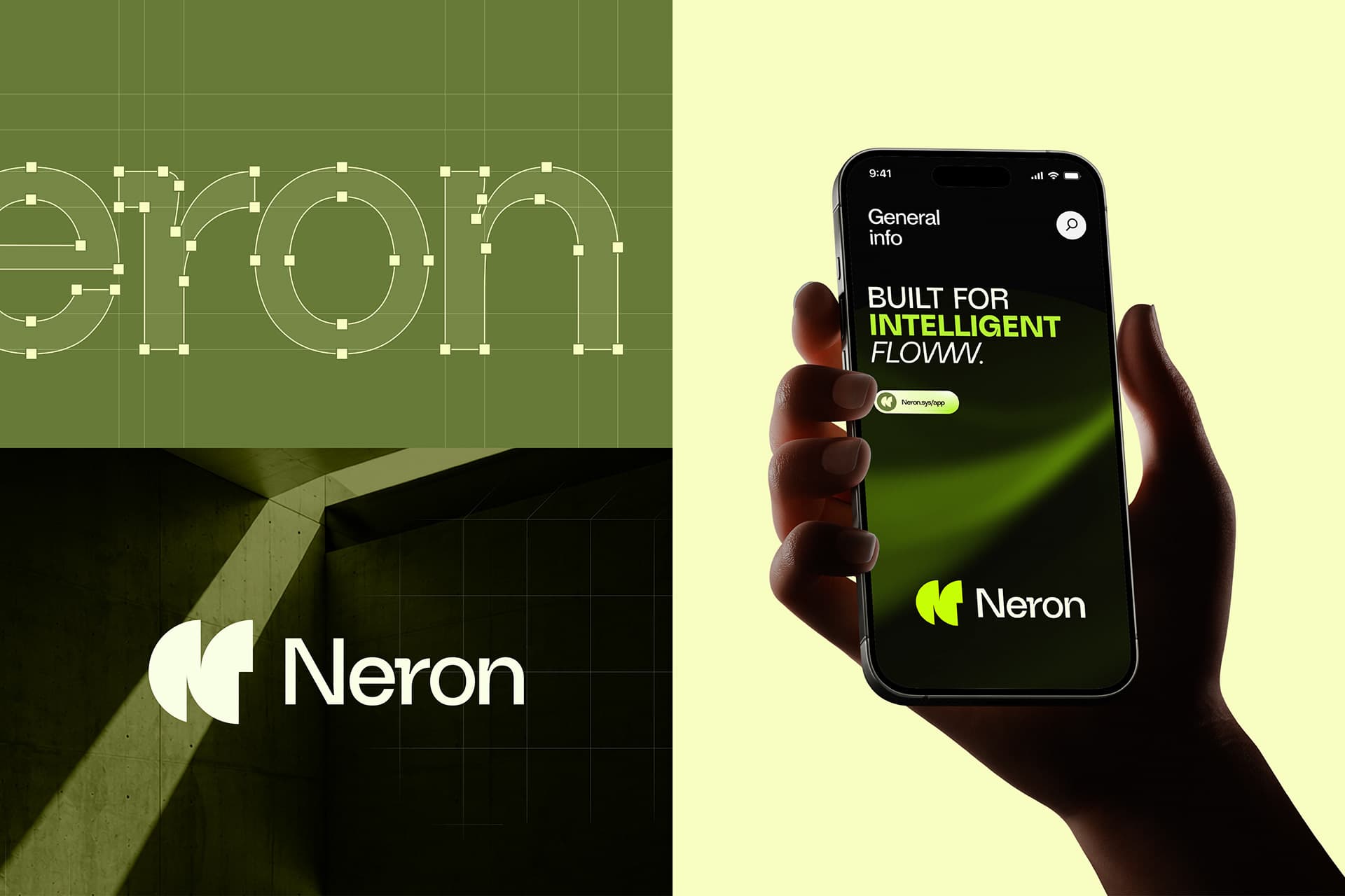
Neron is presented as an AI-infrastructure brand. Its visual direction uses a dark field and electric lime to make an abstract proposition feel immediate, recognizable, and confident.
01 / Signature
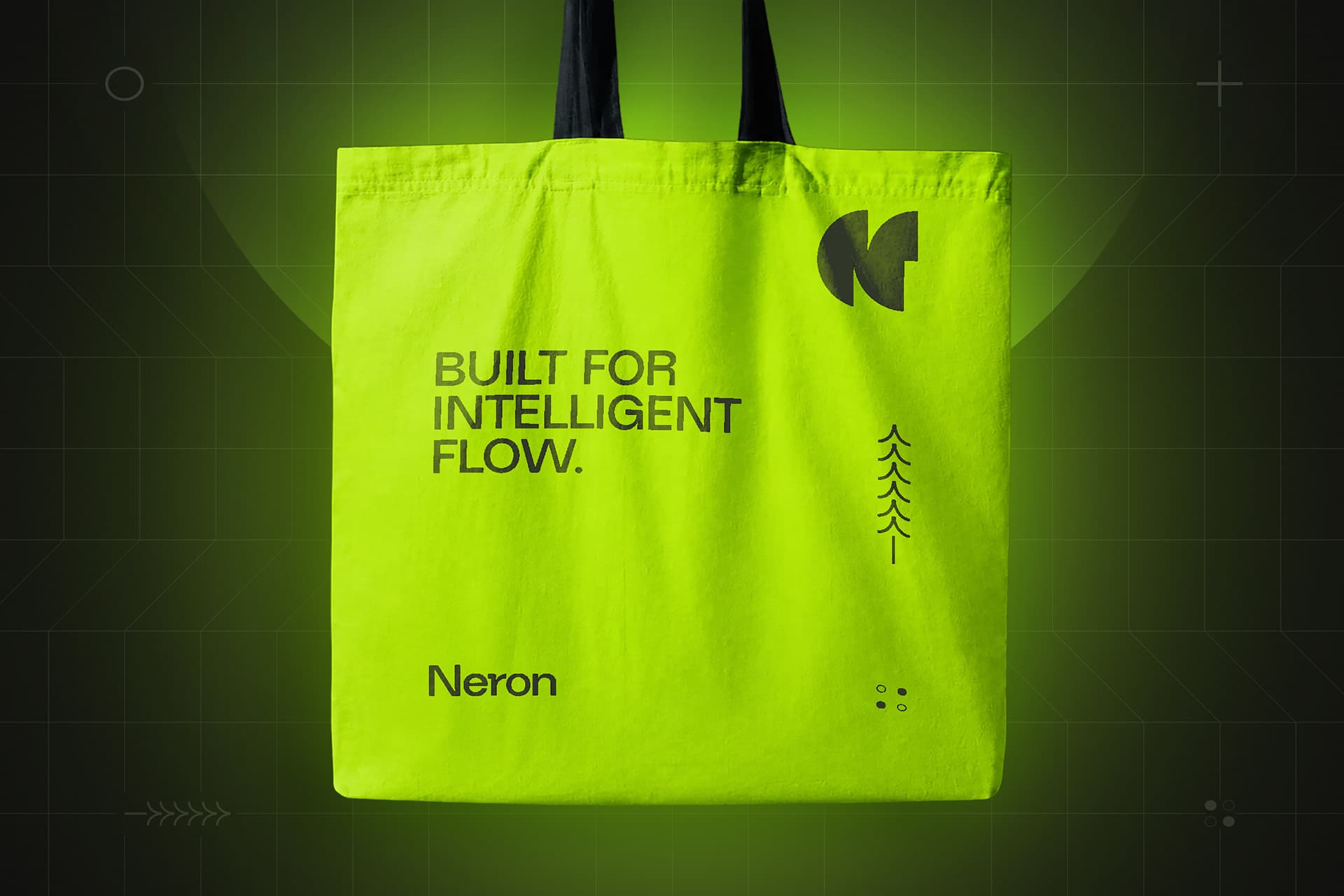
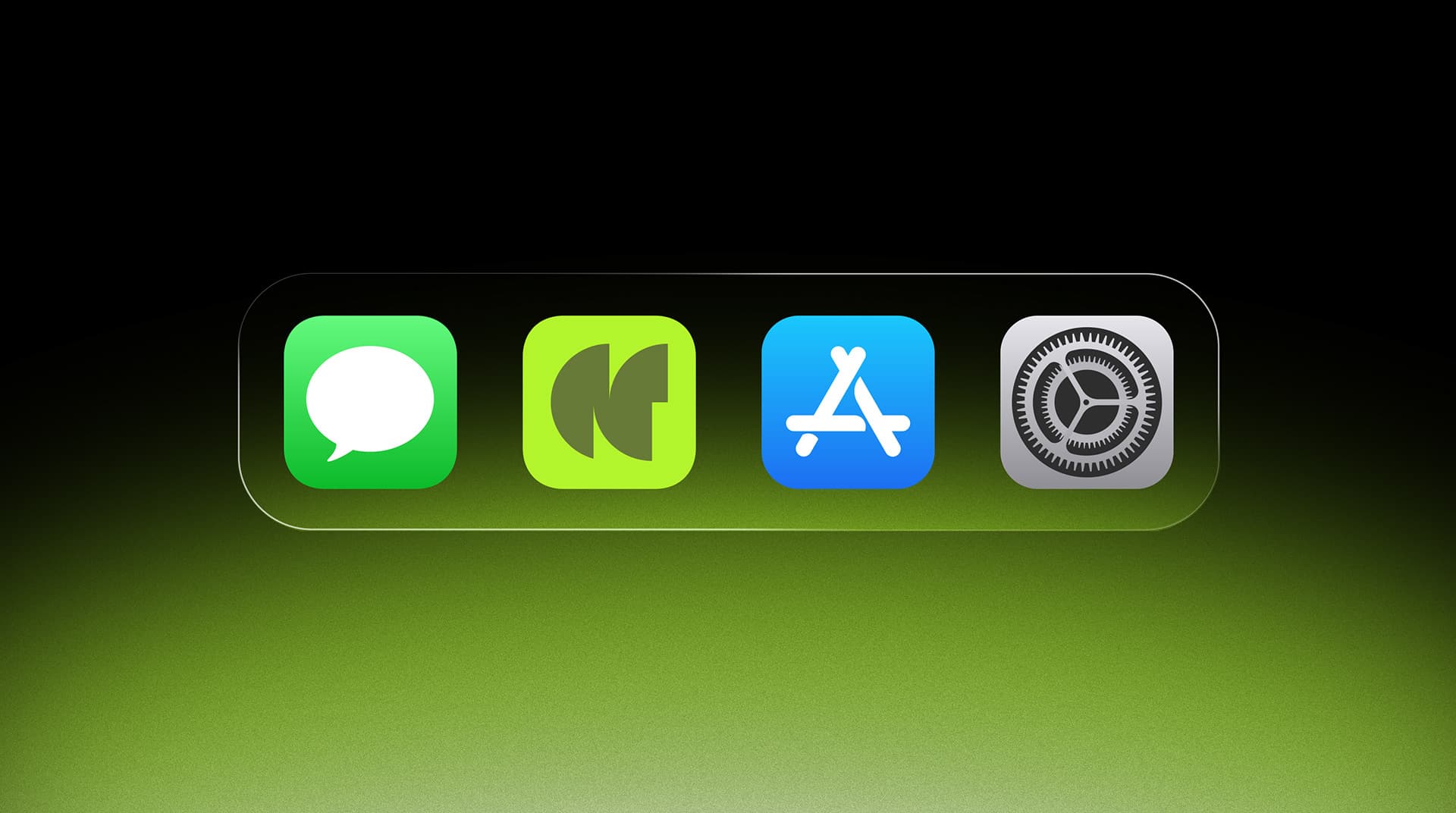
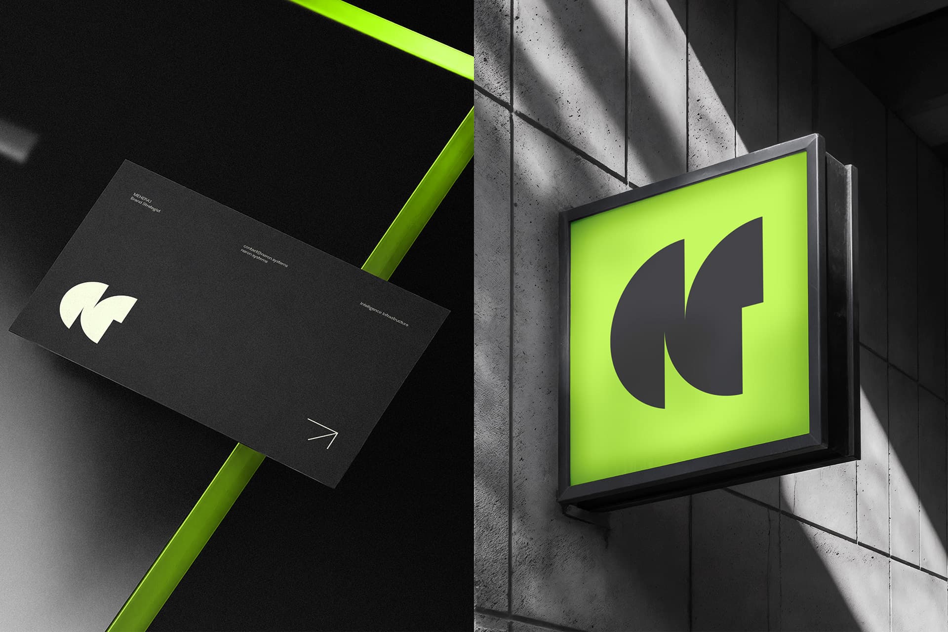
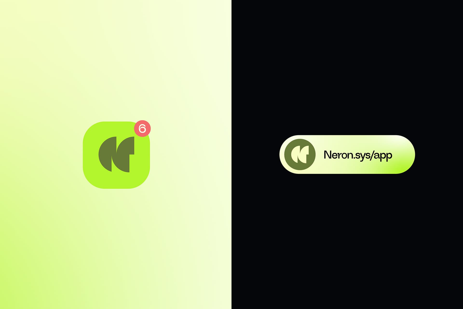
A reduced graphic signature lets Neron work at city scale, in print, and at app-icon scale, with one bright accent carrying the recognition.
02 / Digital
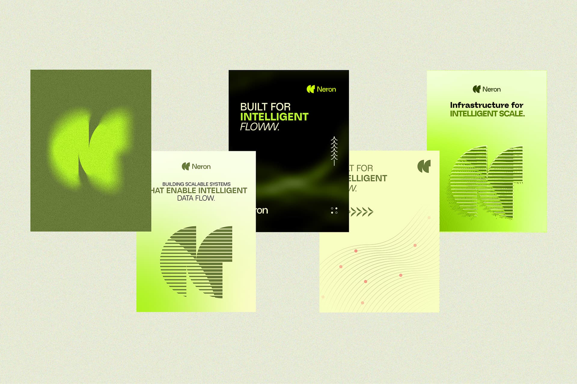
Interface and presentation layouts put the identity to work while preserving contrast, hierarchy, and a sense of technical precision.
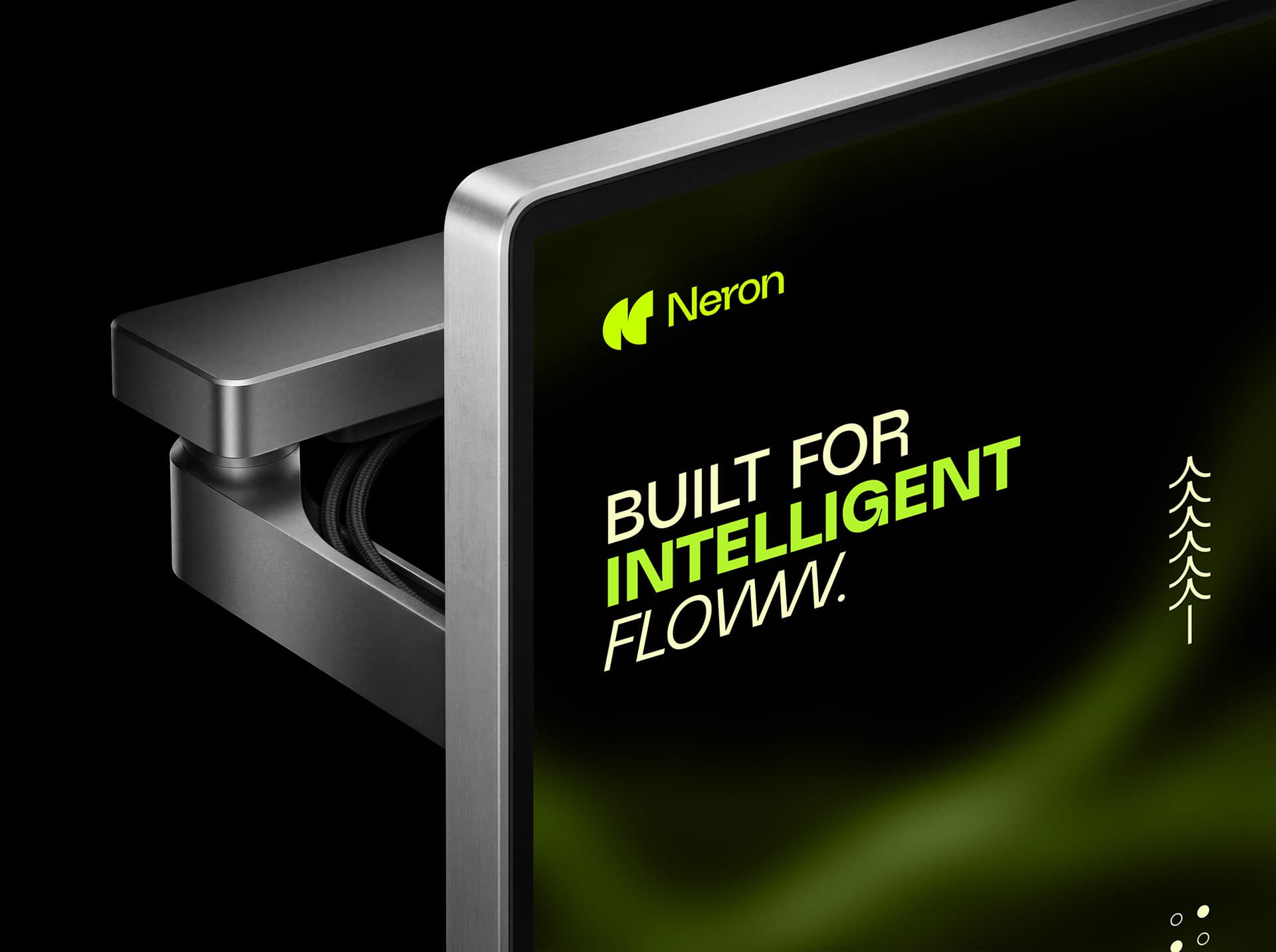
03 / Reach
Campaign graphics carry the same core language into high-attention public and everyday physical formats.