Logistics brand identity / Visual concept
A logistics identity designed to be seen at every scale.
The perspective / Westérico
Westérico is presented as a logistics brand built around visibility and momentum. An angular W, sharp red field, and purposeful typography create a system that holds together across physical and digital touchpoints.
01 / The idea
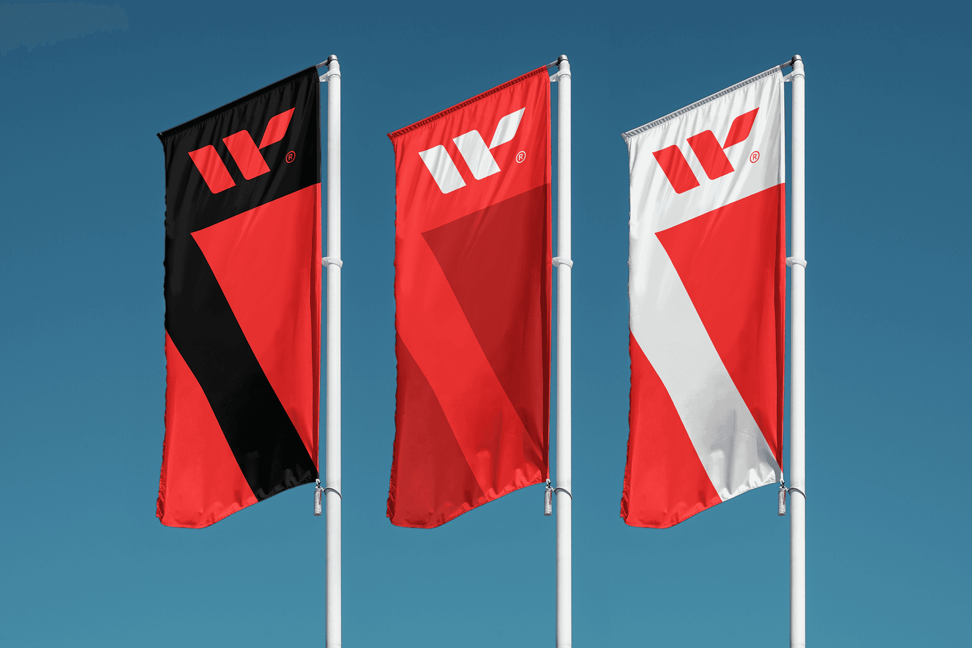
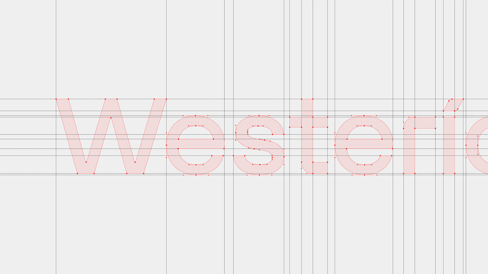
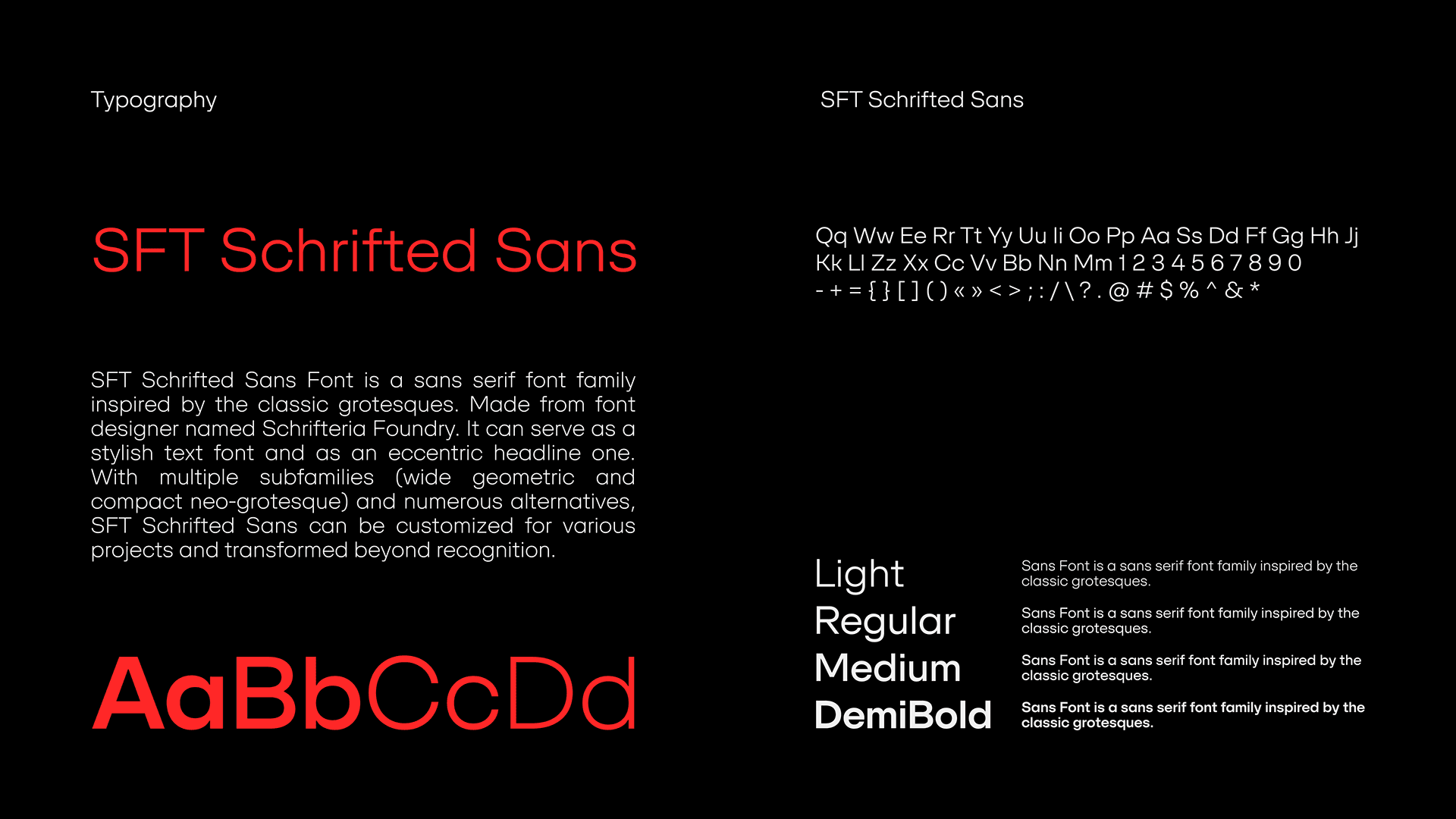
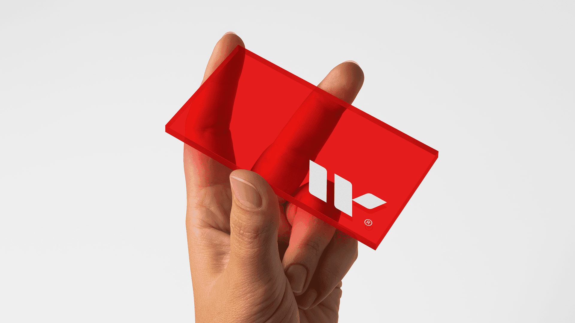
The angular symbol, constructed wordmark, and red-black-white palette establish a recognizable direction before the identity reaches any application.
02 / In motion
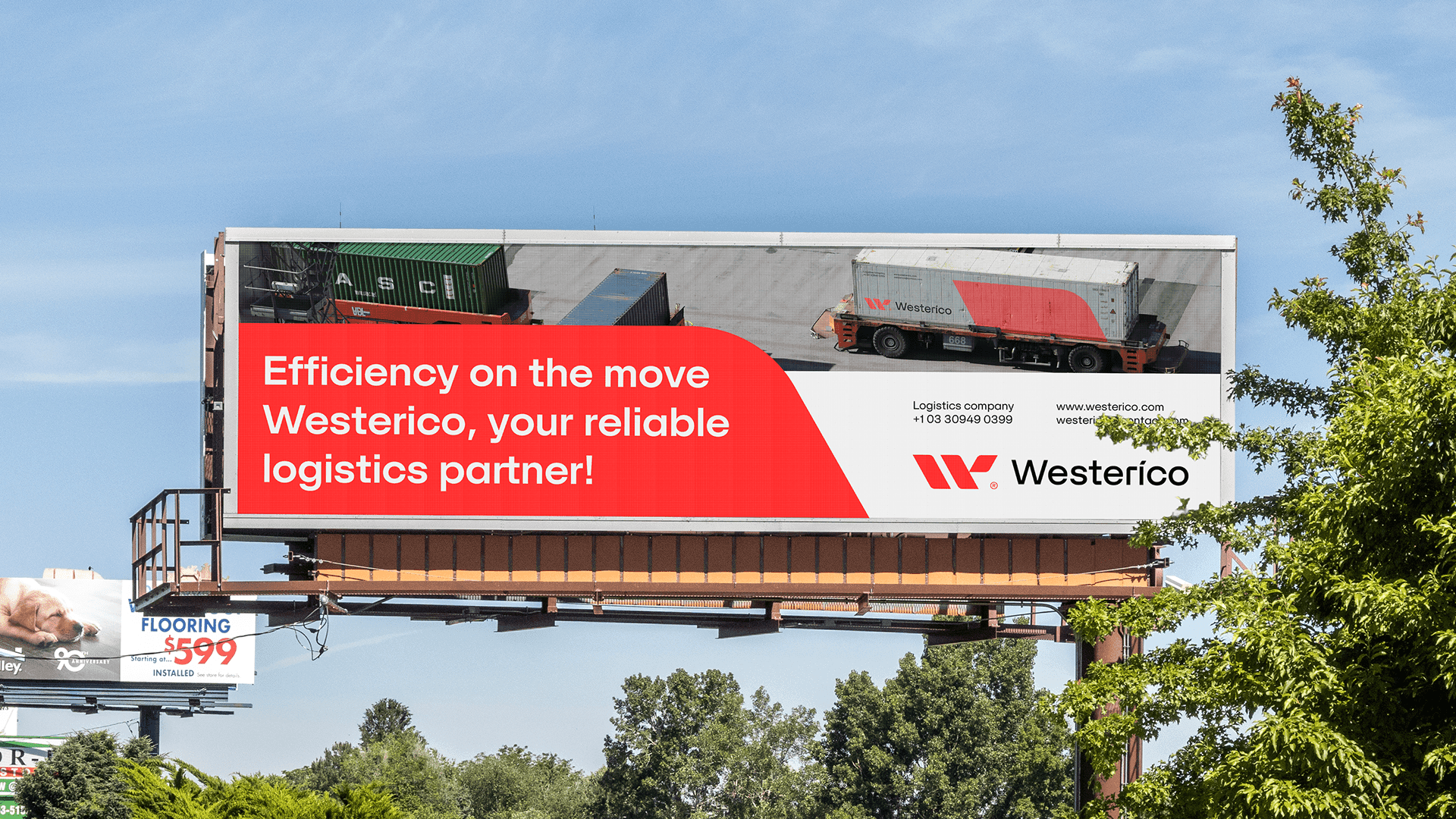
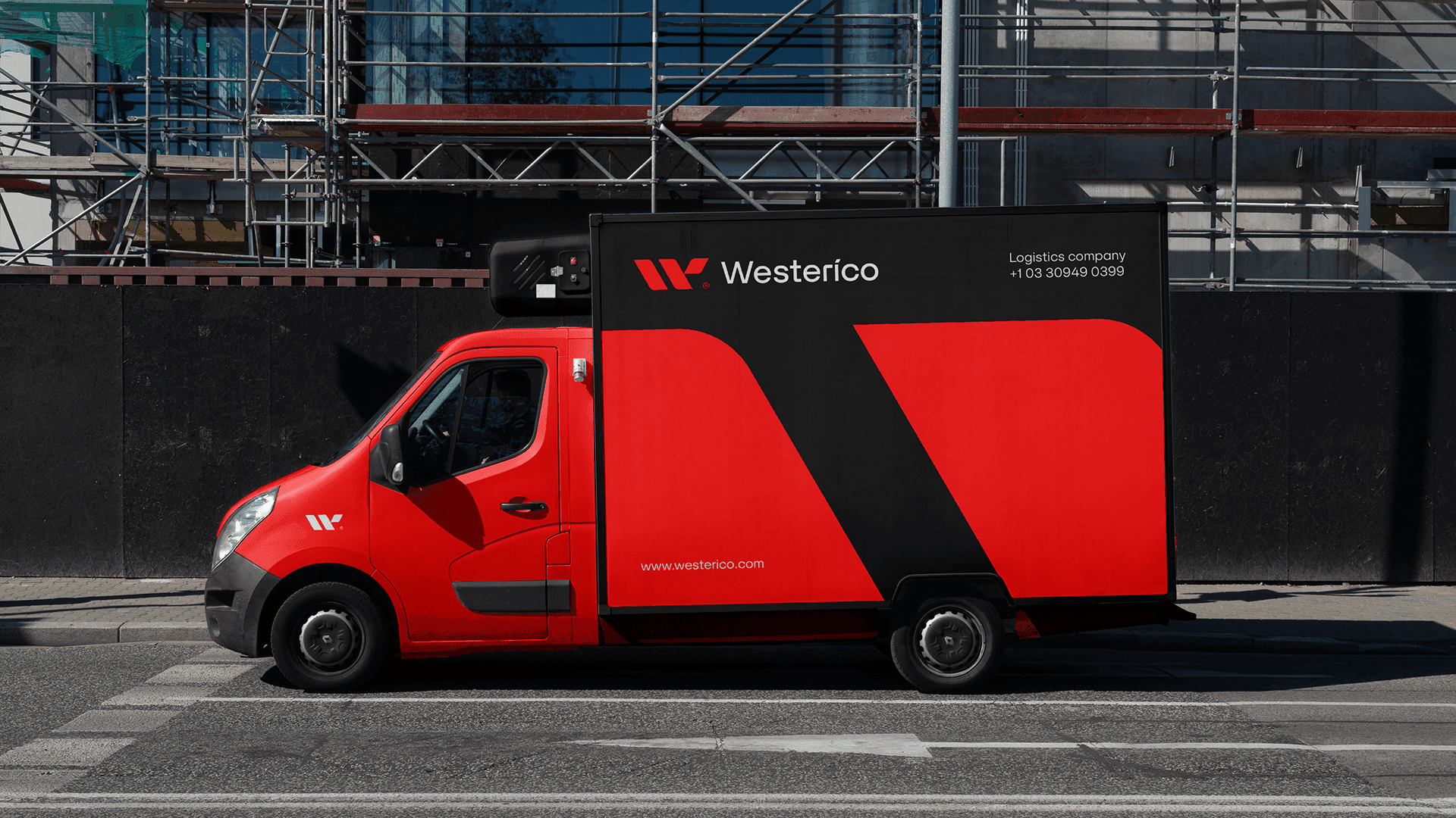
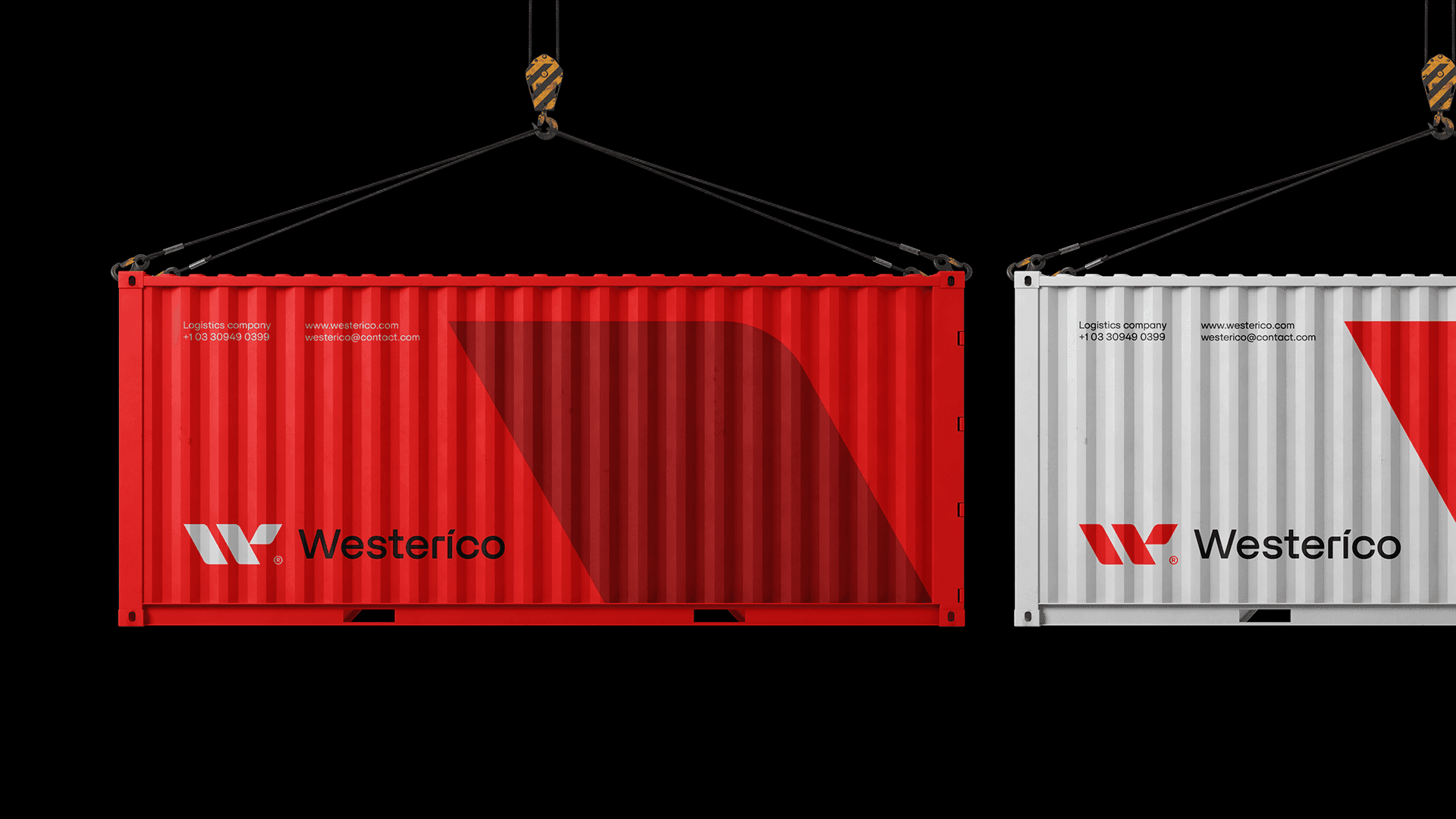
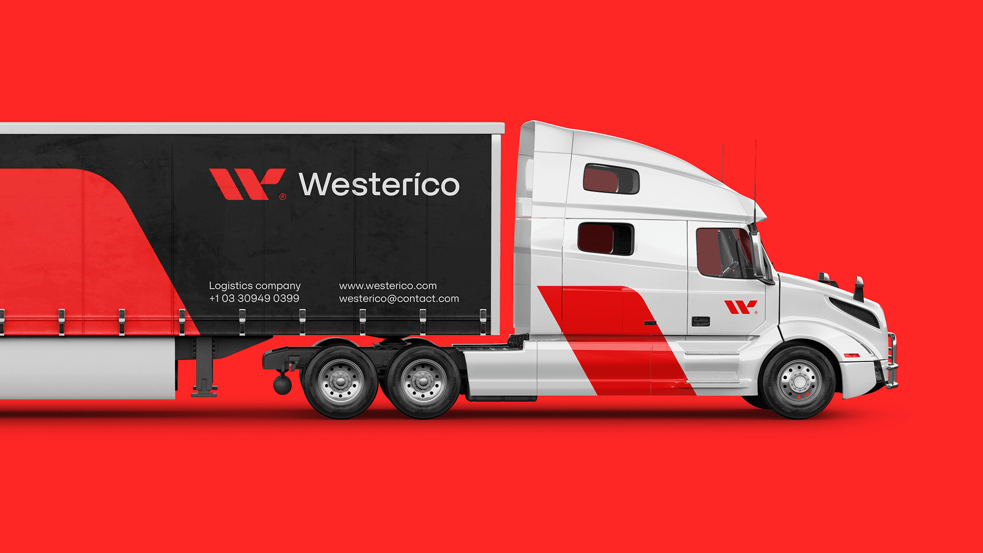
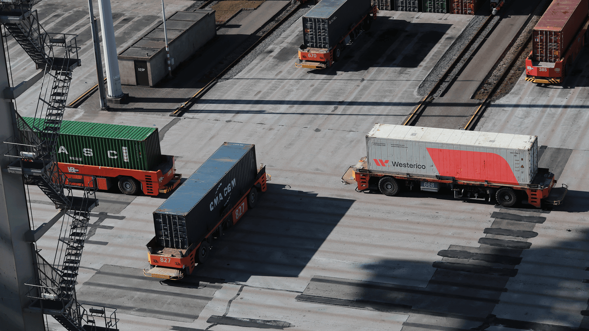
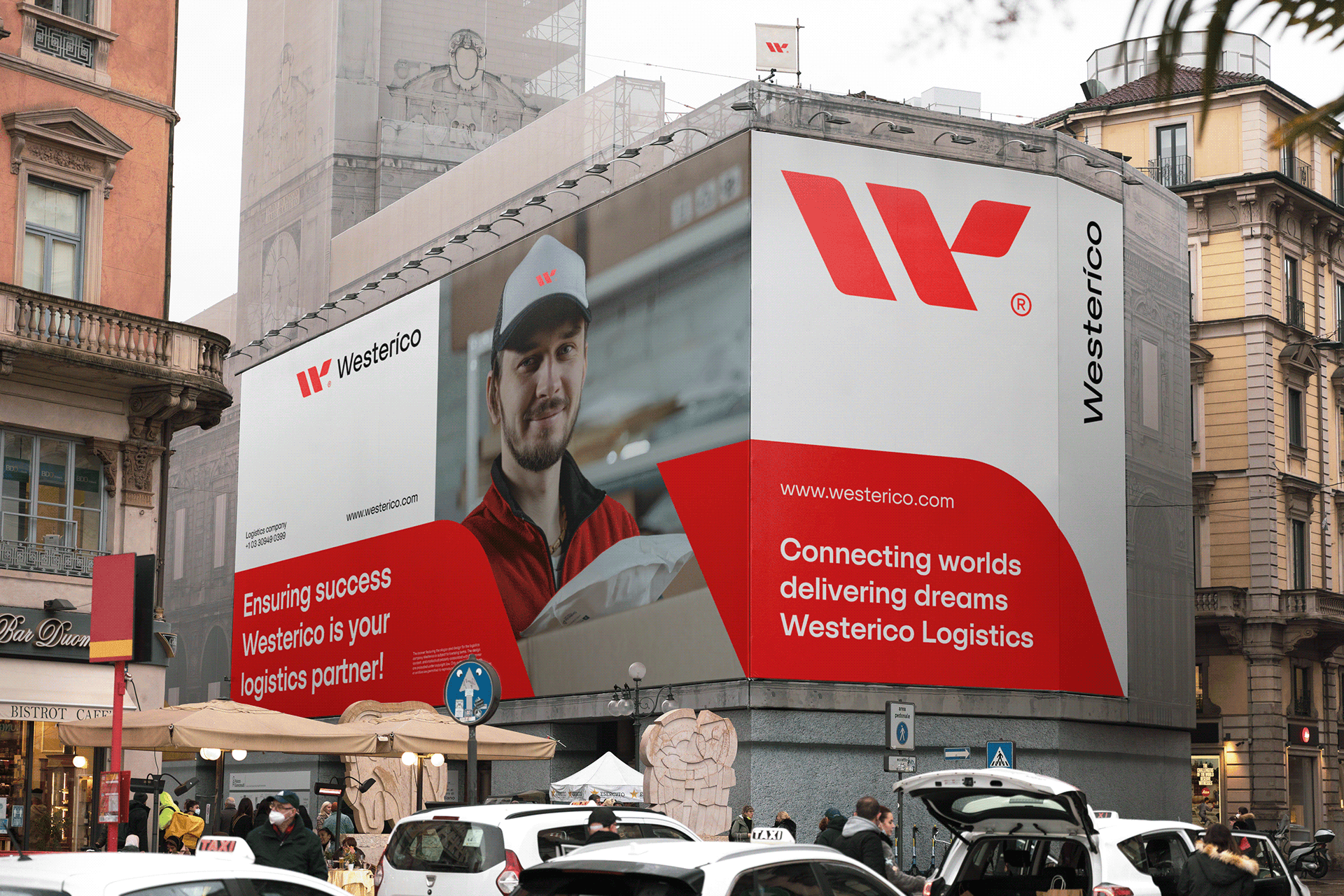
Containers, freight vehicles, and architectural signage turn the identity into a visible part of the delivery journey.
03 / The handoff
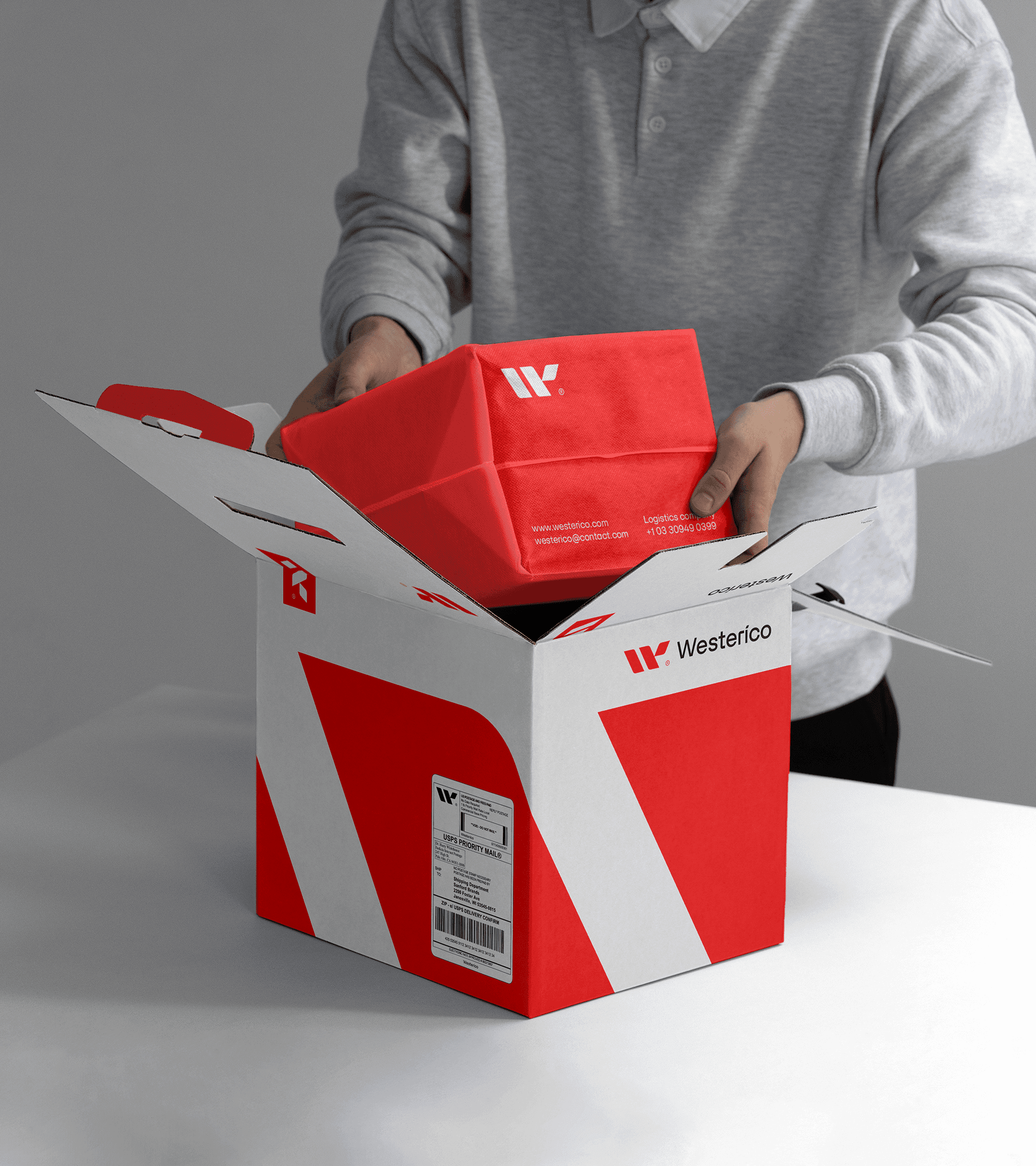
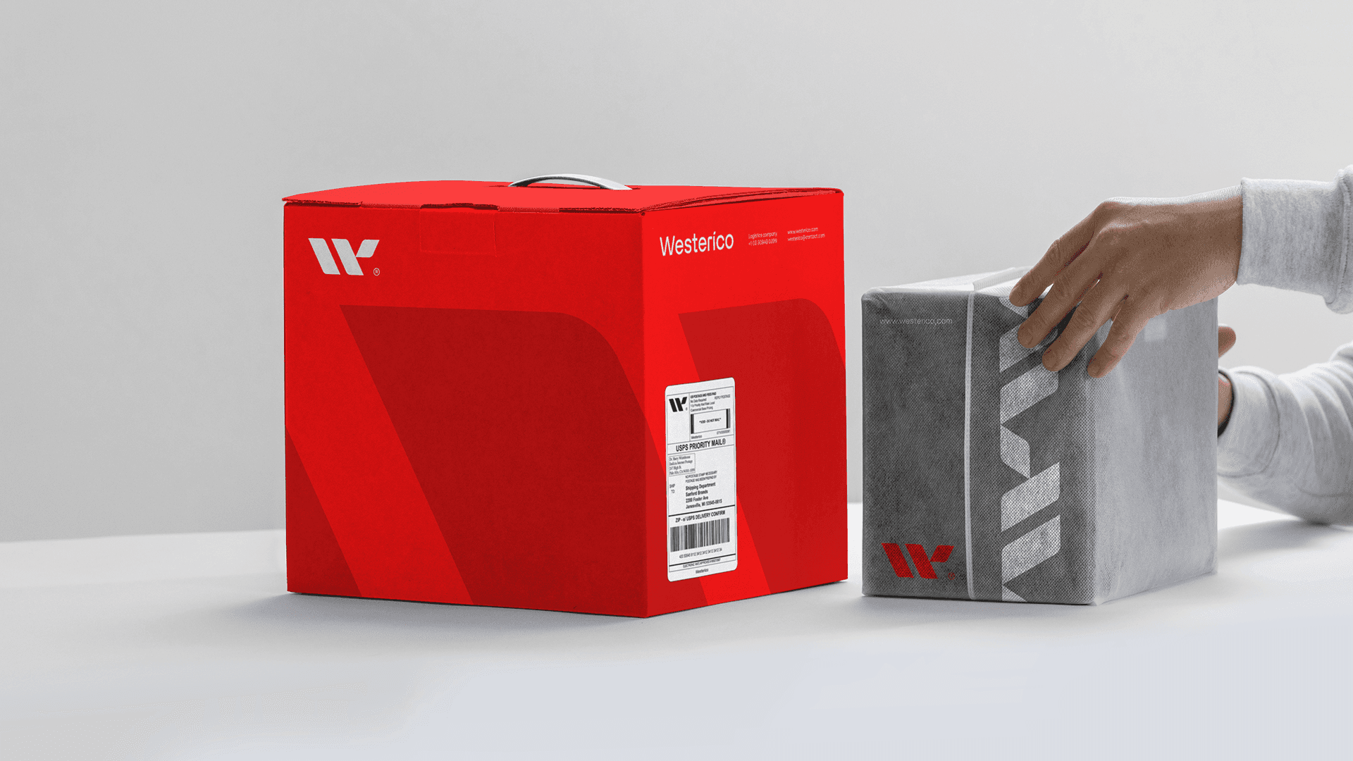
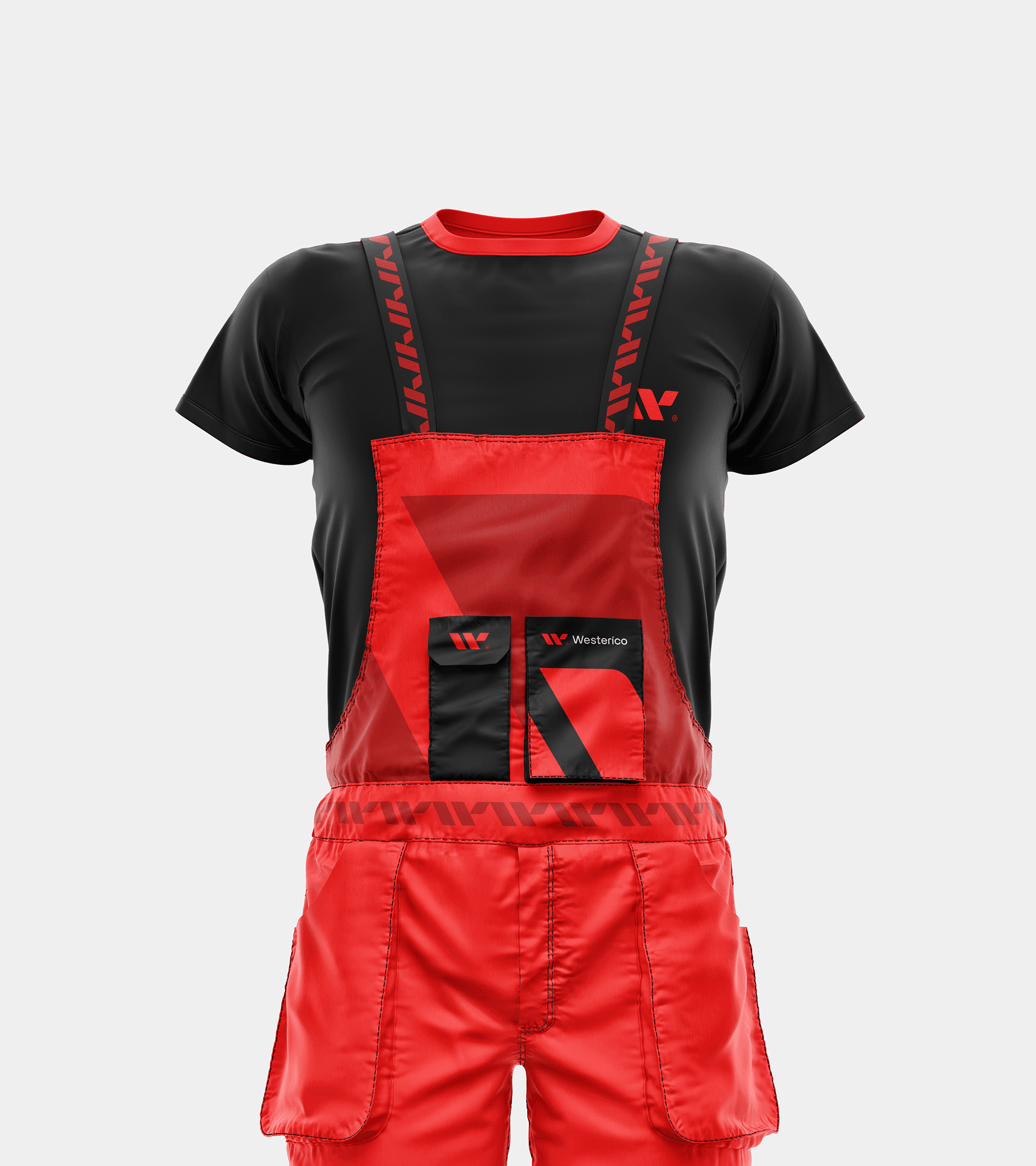
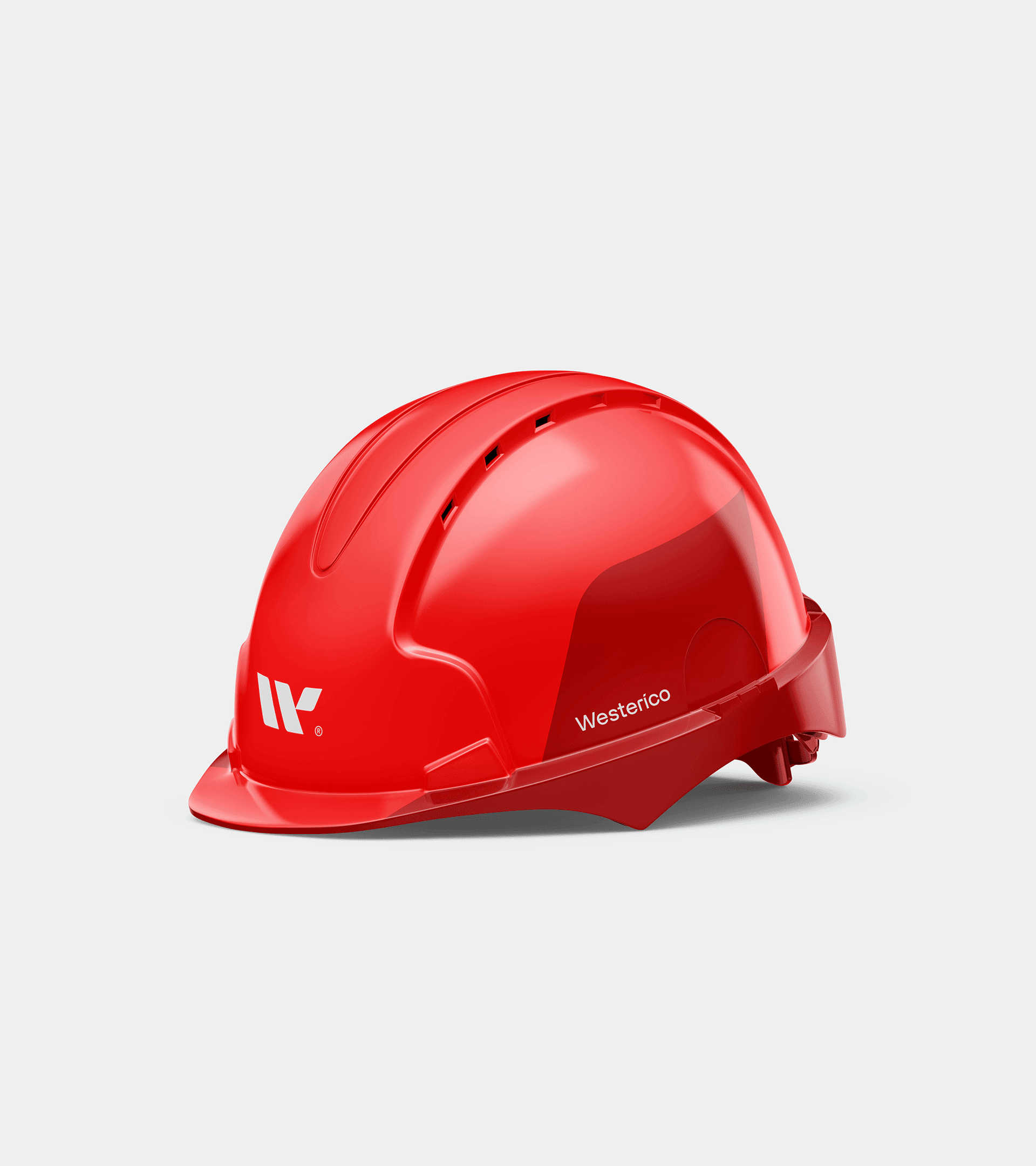
The same visual cues appear on parcels, uniforms, and safety gear, giving the brand a recognizable presence at the moment a shipment changes hands.
04 / Beyond the road
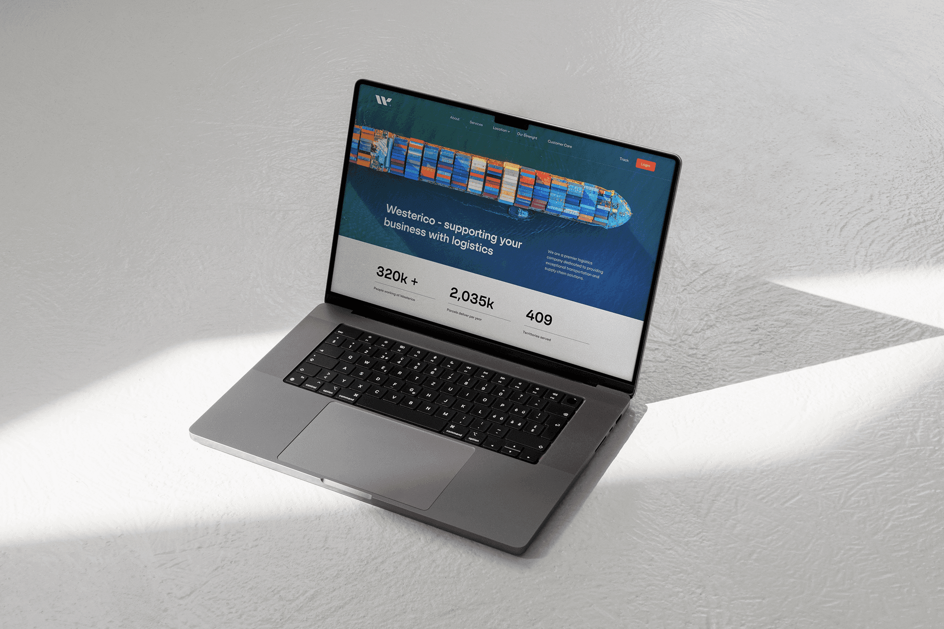
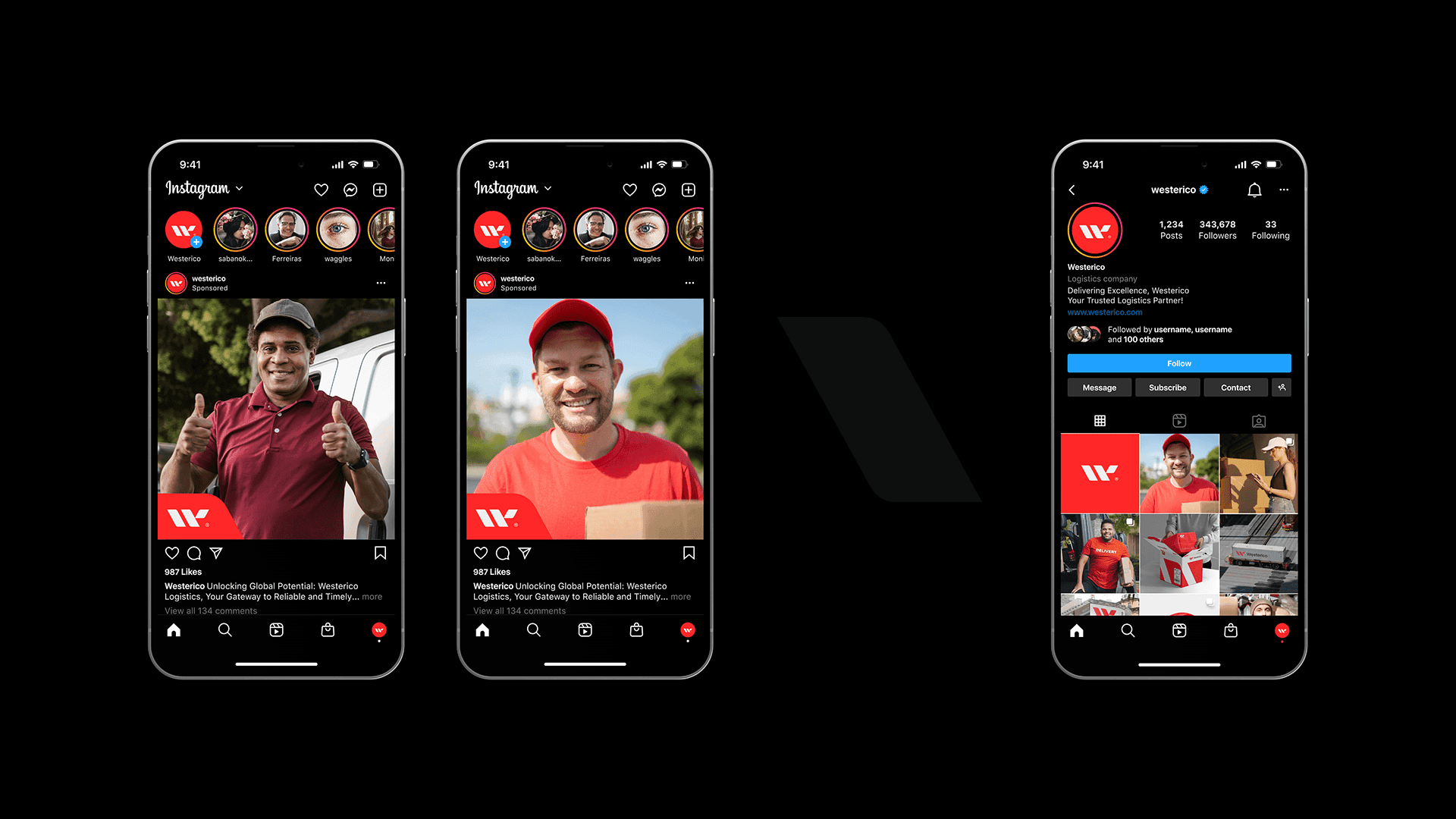
Campaign and digital applications carry the identity into the wider world, from billboards and flags to a website, social graphics, and an app icon.