Navigation
PhasingBuild what comes next
← All work

Delivery service identity / Visual concept

Syvter

A delivery brand made to move.

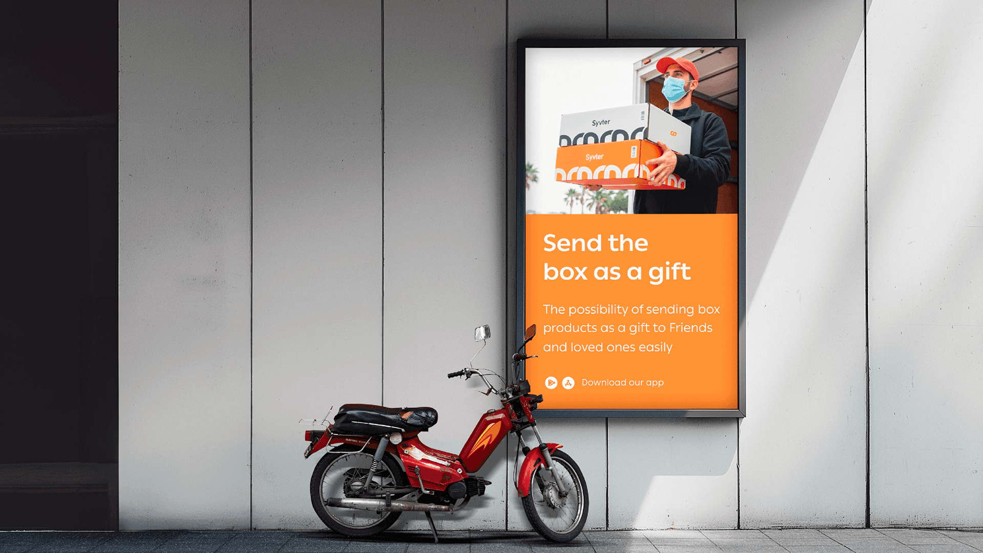
Syvter delivery campaign displayed outdoors

The perspective / Syvter

Syvter explores the visibility a delivery brand needs in motion. A bright palette and decisive shapes connect its fleet, packaging, service materials, and outdoor communications.

01 / Identity

A mark that travels.

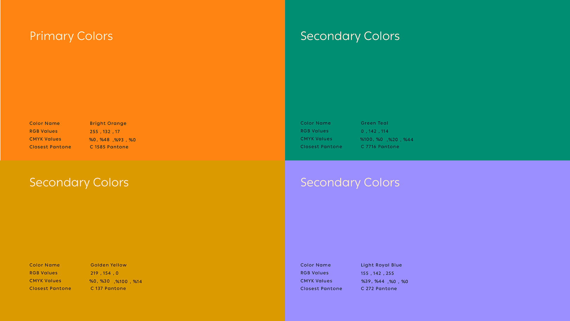
The recognizable mark, warm color, and supporting palette make the system legible across the fast-moving contexts of delivery.
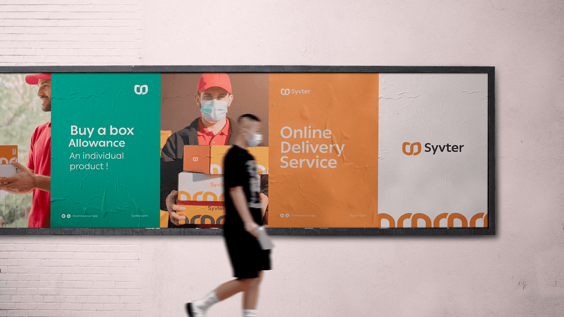
Syvter identity on an outdoor billboard
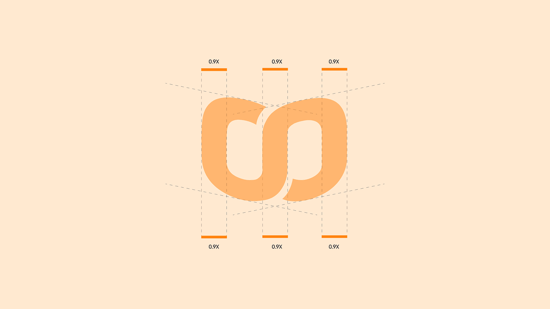
Geometric construction of the Syvter symbol
Syvter visual identity presentation
Syvter primary and secondary color palette

02 / Handoff

The brand in your hands.

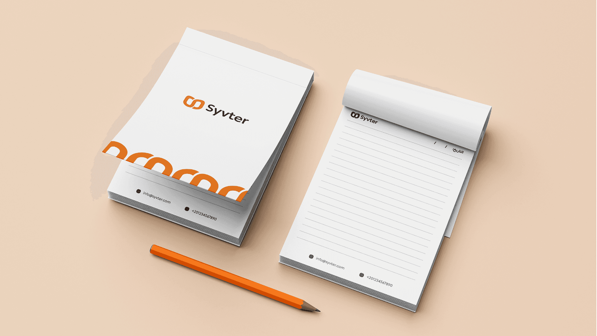
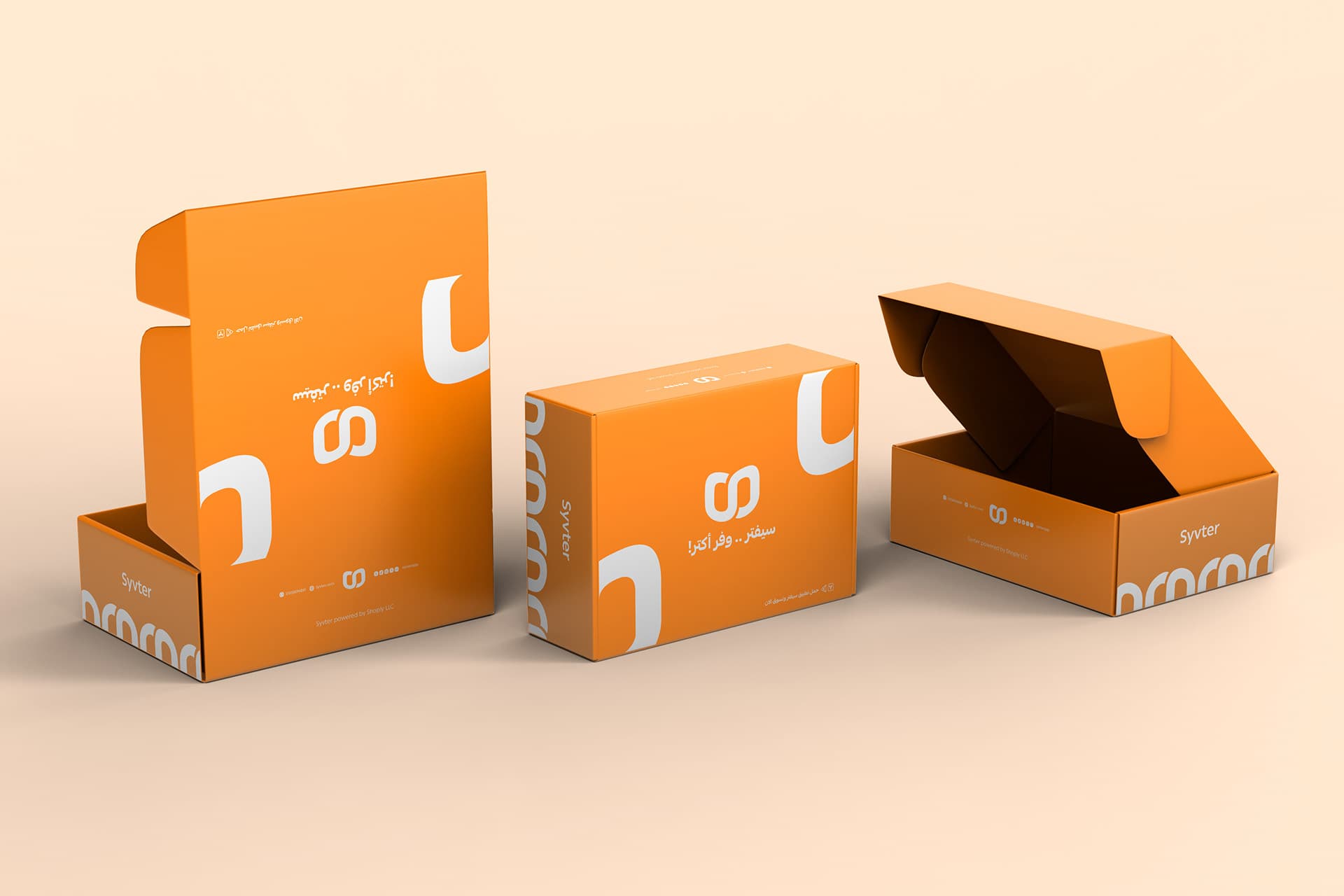
Parcel materials, shipping boxes, and service stationery make the identity present at the moment a delivery is received.
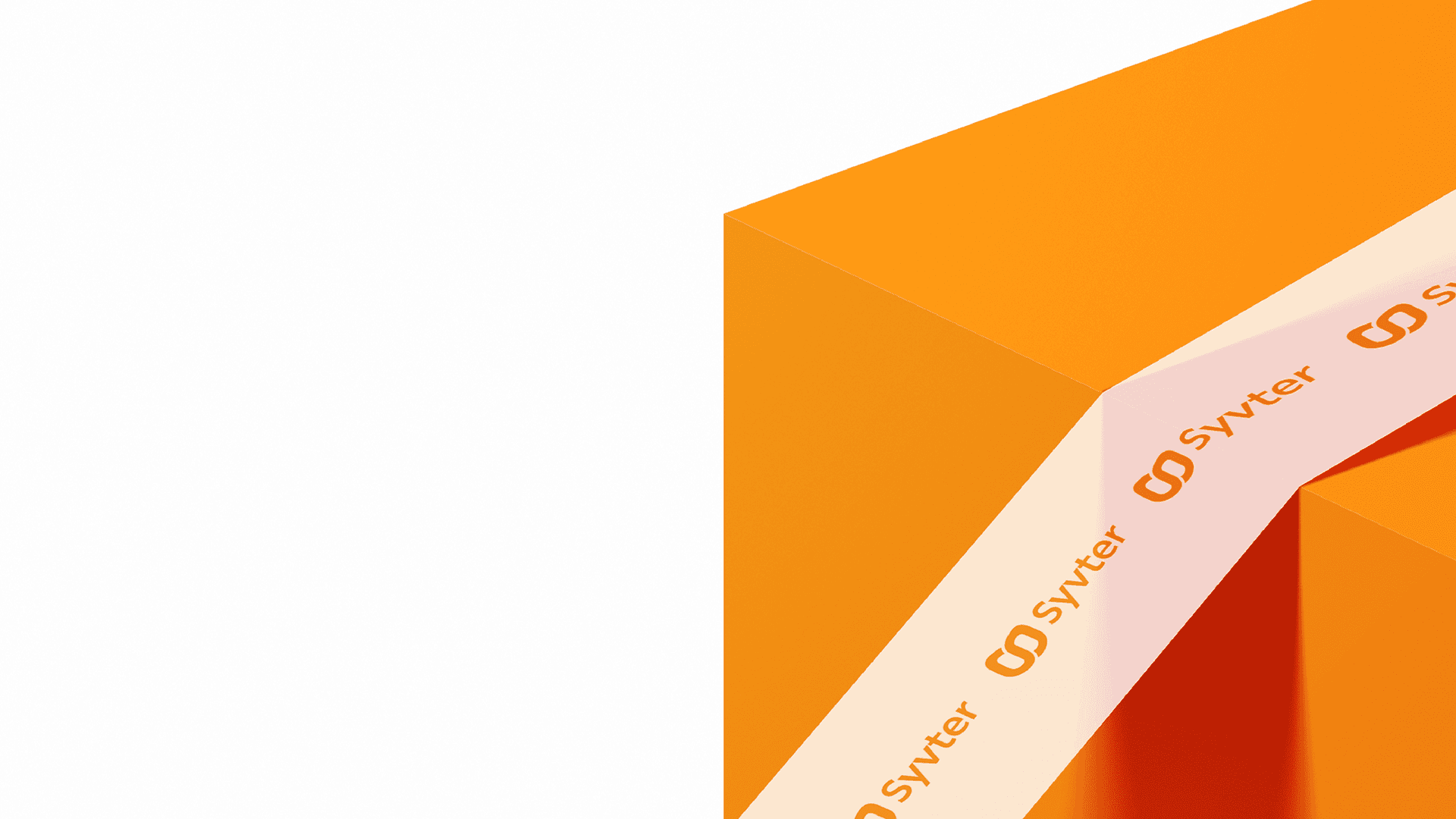
Syvter branded parcel packaging tape
Syvter branded shipping boxes and packaging
Syvter stationery and printed collateral

03 / Campaign

Seen across the city.

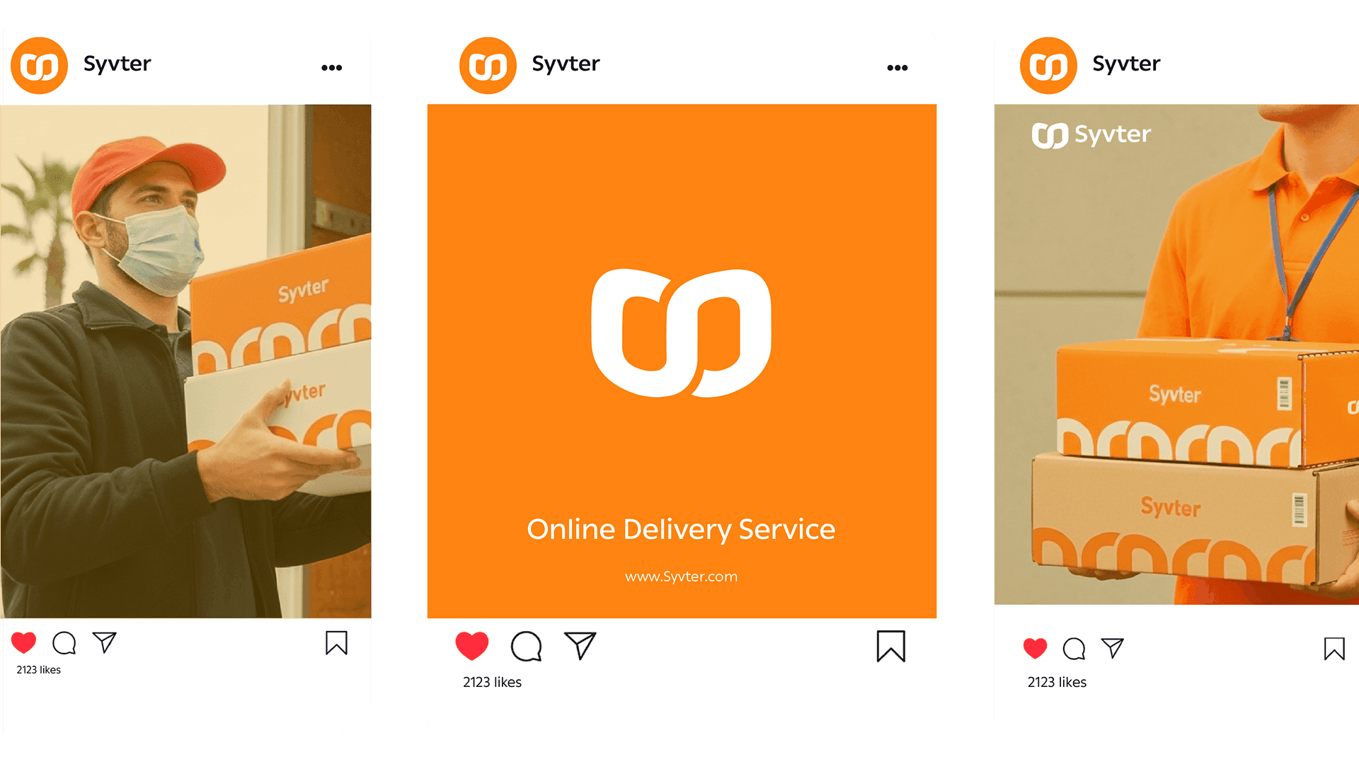
The visual system remains recognizable when it expands into street flags, social, and promotional formats.
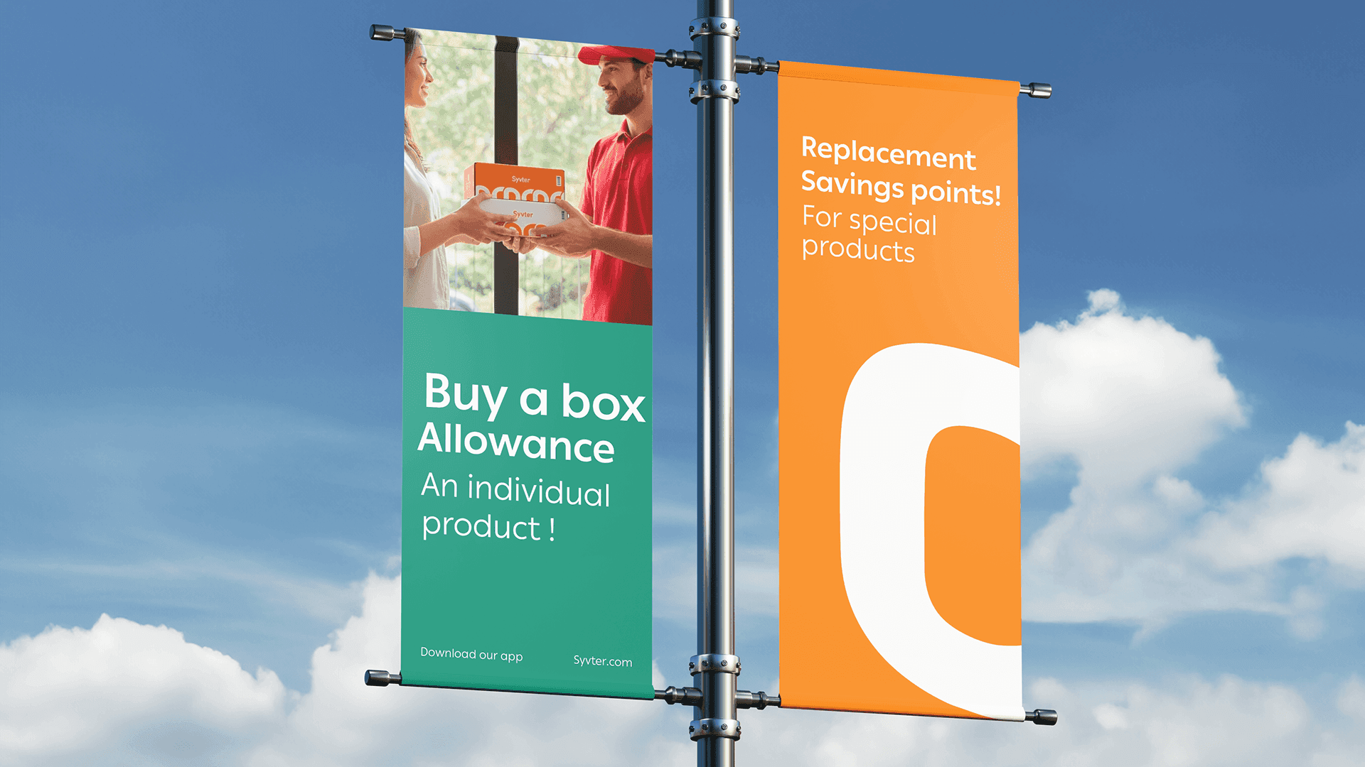
Syvter campaign flags beside a street
Syvter social campaign cards

04 / Digital

A service at a glance.

The symbol also scales down to a compact app icon, keeping the delivery brand recognizable in the places customers use it every day.

Syvter app icon on a mobile home screen

A distinct point of view.

Movement is the medium

Visual concept study, not a commissioned Phasing client project. Supplied third-party reference imagery; creator attribution should be confirmed before publication.

Next: Glass ↗
Loading000%
Send an emailView project